Today, I’m diving into the fascinating world of Responsive Web Design (RWD). Whether you’re a total newbie to the concept or a seasoned web developer looking to brush up on the latest trends, this article is for you. So, grab a snack, settle in, and let’s explore the ins and outs of creating an exceptional Responsive Web Design experience together.
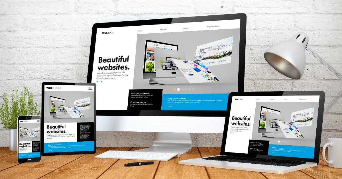
What is Responsive Web Design?
Before we delve into the nitty-gritty details, let’s start with the basics. Responsive Web Design is a design approach that ensures web pages render well on a variety of devices and window or screen sizes. In simpler terms, a website with RWD adapts its layout to fit the screen size of the device being used, whether it’s a smartphone, tablet, laptop, or desktop. This flexibility is crucial in today’s digital age where users access websites from a multitude of devices.
Importance of Responsive Web Design
- User Experience: One of the primary reasons why Responsive Web Design is essential is to provide an optimal user experience. Imagine trying to navigate a website on your smartphone, only to find that the text is tiny, and you have to pinch and zoom constantly. Frustrating, right? RWD eliminates such usability issues, making it easier for users to interact with the site.
- Mobile-Friendly: With the increasing usage of mobile devices, having a responsive website is no longer a luxury but a necessity. A responsive design ensures that your site looks great and functions seamlessly on smartphones and tablets, catering to the growing mobile audience.
- SEO Benefits: Search engines like Google give preference to mobile-friendly websites in their rankings. By implementing Responsive Web Design, you can improve your site’s SEO performance and visibility, ultimately driving more organic traffic to your site.
Key Elements of Responsive Web Design
Now that we’ve covered the why let’s delve into the how. Here are some key elements that contribute to creating a successful Responsive Web Design:
- Flexible Grid Layout: Employing a flexible grid layout allows elements on the page to resize proportionally based on the user’s screen size. This grid system ensures that the design remains visually appealing across various devices.
- Media Queries: Media queries are CSS rules that enable you to apply different styles based on the device’s characteristics, such as screen width, height, and orientation. By using media queries, you can tailor the layout and design for specific screen sizes, ensuring a consistent user experience.
- Fluid Images and Videos: Incorporating fluid images and videos that scale with the size of the screen is crucial for a responsive design. This approach prevents images from overflowing or getting cropped on smaller screens, maintaining the visual integrity of the content.
Testing and Optimization
- Cross-Browser Compatibility: It’s essential to test your responsive design across multiple browsers to ensure consistent performance. What looks good on Chrome may not render as expected on Safari or Firefox. By testing on various browsers, you can identify and fix compatibility issues, providing a seamless experience for all users.
- Performance Optimization: In today’s fast-paced digital landscape, users expect websites to load quickly across all devices. Optimizing your site’s performance by minifying CSS and JavaScript, optimizing images, and leveraging caching techniques can improve loading times and user satisfaction.
The Future of Responsive Web Design
As technology continues to evolve, the future of Responsive Web Design looks promising. With the rise of new devices like wearables and smart TVs, designers and developers will need to adapt their approaches to ensure seamless experiences across all platforms. Embracing emerging technologies like AI and machine learning can further enhance the responsiveness and interactivity of websites, creating more engaging user experiences.
Conclusion
In conclusion, Responsive Web Design is not just a trend but a fundamental aspect of modern web development. By prioritizing user experience, mobile-friendliness, and optimization, you can create websites that resonate with audiences across various devices. So, whether you’re a beginner exploring the world of web design or a seasoned pro honing your skills, embracing Responsive Web Design is the way to go.